Enter the password to view this case study.
I redesigned a healthcare scheduling system — dashboard, schedule, templates, manager mobile — for a product that existed but wasn't keeping up. Two interfaces, one system: managers on desktop, nurses on mobile.
LastMinute had a manager-only desktop app in beta for a few months, tested internally — no nurse interface, no mobile. I joined a team of three designers plus engineering to redesign the manager side and build the nurse experience from scratch. I owned the manager core (dashboard, schedule, templates, mobile companion) and the system architecture the whole team designed against.
The old product treated scheduling as a manager task. But every shift decision has two sides — someone assigns it and someone works it. Designing for both meant two completely different interfaces sharing one system.
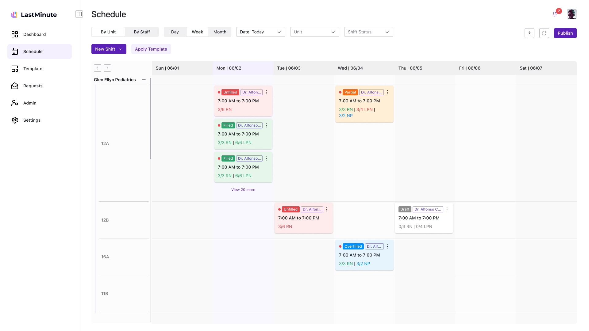
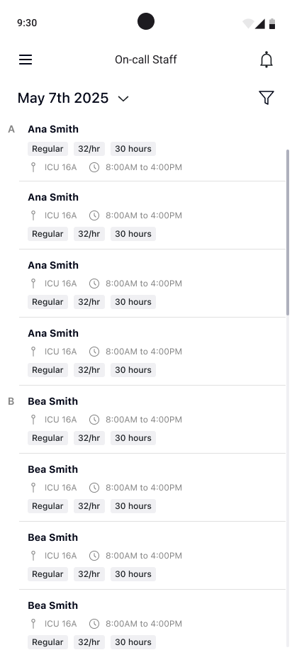
Schedule grid, request queue, coverage gaps, staff availability, templates, admin. Charge nurses live in this all day. One glance should answer: "Are we covered?" The old product had this — but scattered across disconnected pages with no shared IA.
Daily schedule, shift notifications, pick-up opportunities, call-out flow. Nurses check between patient rounds — 15 seconds, one thumb, on a phone in their scrub pocket. This didn't exist before. We built it from scratch.
The old product had been built feature-by-feature over years — shift call-outs bolted onto a schedule page, a marketplace added as an afterthought, PTO buried in a settings panel. Before touching a single screen, I spent three weeks mapping how hospitals actually handle shift coverage: what happens at 2 AM when a nurse calls out, who gets notified, how shifts get traded across clinics, and where the process breaks down. That map became the blueprint for everything that followed.
Talked to charge nurses who manage floor coverage, hospital administrators who track labor spend, and on-call staff who pick up shifts. Each had a different mental model of the same system — and none matched the existing UI.
Broke the product into five subsystems in FigJam: shift assignment, coverage requests, PTO management, shift swaps, and the cross-clinic marketplace. Mapped current-state vs. proposed flows for each — this caught three circular dependencies before we wrote a line of code.
Defined a five-surface architecture — Dashboard, Schedule, Templates, Requests, Admin — with shared component patterns and naming conventions. Then split ownership: I took the manager core, teammates took requests and nurse mobile. The shared IA kept us in sync without daily check-ins.
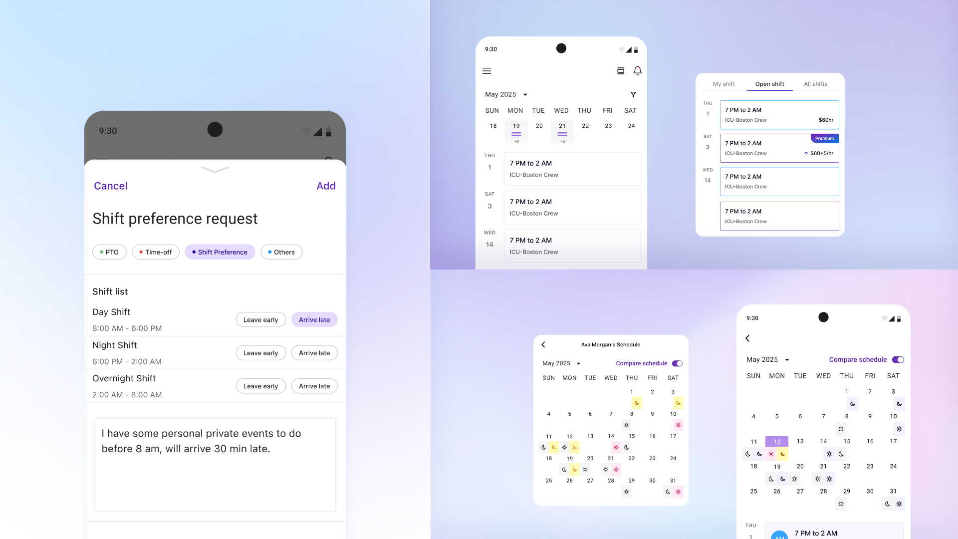
Shipped in four passes: v2.0 (structure + layout), branding refresh (7 logo iterations alone), v2.1 (connected flows), v2.2 (polish + edge cases). Weekly crits with all three designers plus engineering kept the two platforms — desktop and mobile — from drifting apart.
Hospitals don't have time for ambiguous design decisions. AI didn't make the calls — it compressed the time between insight and the next call I had to make.
Across three weeks of system mapping, I had Claude cluster charge-nurse, admin, and on-call interview transcripts. The clusters made it obvious that the same word — "coverage" — meant three different things to three users. That insight became the Manager / Nurse split.
The "are we covered?" dashboard and the scheduling-grid edit affordances were prototyped with Gemini's code generation before they reached the design file. Testing hover states and information density on real DOM was faster than mocking forty variants in Figma.
Before each release, Claude reviewed the dashboard against WCAG AA targets — contrast, focus order, error states. I also asked it to imagine a 12-hour shift and surface which scheduling-grid edge cases would break first; overfilled positions came back at the top of the list.
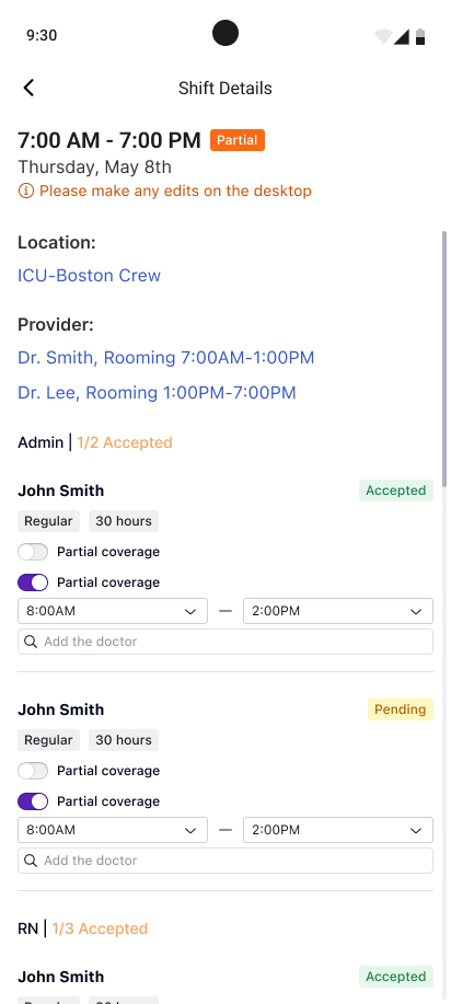
The biggest design challenge was the connection between templates and the schedule. Hospitals already had staffing data in spreadsheets — I designed a flow where managers import their Excel, generate a reusable template, apply it to any week, then add custom shifts on top. Templates are the base layer; customizations sit above without breaking the blueprint.
Managers created templates in one place and applied them somewhere else. They'd build templates but forget to apply them, or edit the schedule directly and lose template changes.
I added apply-to-schedule directly in the template flow. But the schedule didn't distinguish template shifts from custom additions — managers couldn't tell what would change on a template update.
Template shifts and custom shifts became distinct visual layers. Updating a template propagates without touching customizations. Weekly crits pushed me to add import error handling and a "start from last week" shortcut.
My primary ownership. I redesigned the dashboard, scheduling grid, template system, and manager mobile app — the surfaces managers live in.
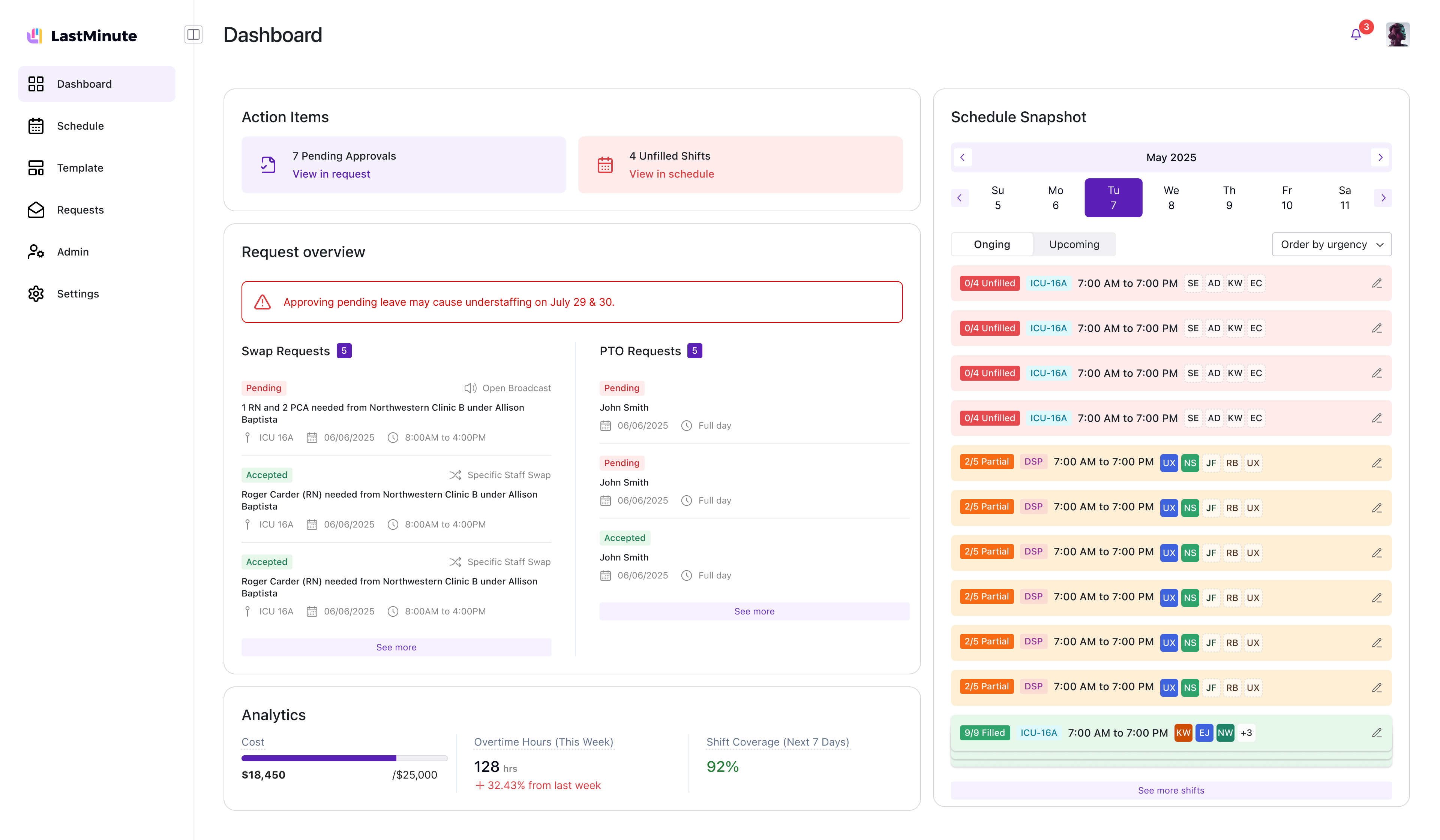
Redesigned around "action items" instead of the old "current state" view. Pending approvals, unfilled shifts, coverage warnings — one glance answers: are we covered?
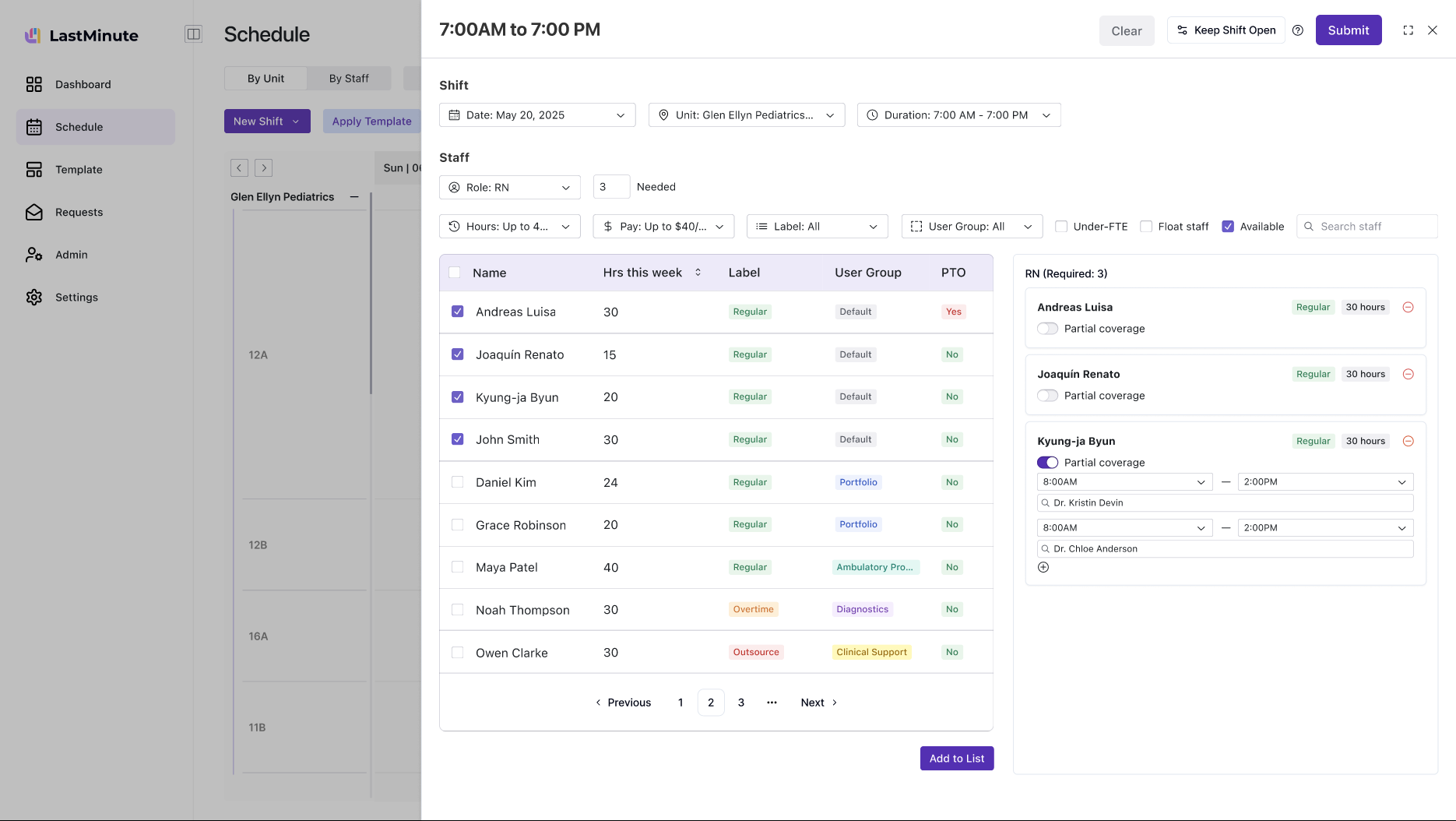
Two views: by area (ICU, Pediatrics, ER) and by staff. Create regular and customized shifts, edit published shifts, manage overfilled positions. Constraints baked in.
Configure once, apply to any week. Roles, times, staff counts. I designed the creation flow, apply-to-schedule interaction, and empty-state onboarding.
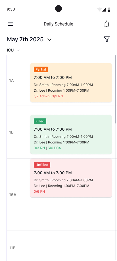
Companion app: today's schedule, on-call staff with advanced filters, shift details, push notifications on lock screen. A quick-check tool for the hallway.
Departments, roles, user groups, shift times. Another designer owned these; I set the IA and patterns they built on.
PTO requests, coverage requests, shift marketplace. A teammate designed the flows; I defined the system model (draft → send → accept/decline).
A teammate owned the nurse app. I built the system architecture it plugs into — notification taxonomy, shift status model, data flows. When a nurse accepts a shift on mobile, the manager's grid updates instantly. That connection was my responsibility.
Today's shifts, times, location, staffing level. Tap for full details. Swipe for other days.
All / Updates / Actions. Call-outs, shift offers, swap requests. One tap to accept or decline. Push on the lock screen for urgent items.
Urgent coverage: big accept/decline. Availability calendar: mark which days you can work. PTO: pick dates, submit, get notified.
I built the dashboard and scheduling grid; a teammate built the nurse app. Core loop worked, but the mental model was wrong — managers treated scheduling as a task, not a strategy. That insight reshaped my dashboard in v2.1.
I led branding end-to-end. Explored many logo directions, landed on a purple-dominant palette with a bar-chart icon. Built the design system all three designers used.
I redesigned the dashboard around action items. A teammate built the Shift Marketplace flows against the system model I defined. Templates, admin, and the request system all came together in this round. Weekly crits kept surfaces aligned.
All three designers converged. I led the consistency pass — ensuring admin, requests, and nurse app followed the patterns from the manager core. Comprehensive dev handoff across every surface.
Three designers, seven months, one cohesive product. I owned the manager core and the system architecture everyone designed against.
Three designers covered a massive surface because the architecture was shared. User flows, component patterns, and naming conventions upfront meant everyone could work independently while staying cohesive.
FigJam caught more problems than any wireframe review. Understanding the system before designing the screens made every iteration faster.
The schedule grid worked once we stopped trying to make one layout answer every question. "By area" and "by staff" each did one job well — clearer than a single view with ten filters.
Users had muscle memory. Every improvement had to justify the disruption — especially where getting it wrong means an understaffed ward.